The Ultimate Guide to Construction Logo Design

We built these construction company logos! Get yours here.
In the competitive construction industry, having a professionally crafted construction logo design will help your business stand out.
Whether you specialize in residential building, commercial projects, or a niche service like roofing or landscaping, your logo is often the first impression potential clients have of your brand.
In this guide, we’ll explore everything you need to know about construction logo design, including key principles, examples, and how to get a logo that truly represents your business.
Why Your Construction Logo Matters
Your logo is more than just a design; it’s the cornerstone of your brand identity. First impressions matter, and your logo is often the first thing clients see when they encounter your company.
A polished, professional design immediately communicates reliability and expertise, which can set the tone for your client relationships from the start.
Without a strong logo, potential clients may overlook your business or view it as less credible.
It’s an opportunity to show your audience that you’re serious about your work and committed to excellence.
A memorable logo also plays a crucial role in brand recognition. It helps clients identify your company across various platforms, from business cards and trucks to social media and job site signage. Over time, this consistent visibility builds trust and familiarity, encouraging repeat business and referrals. The more often a potential client sees your logo, the more likely they are to think of your company when they need construction services.

Here’s one of our client’s construction logo designs on the back of their trailer at a job site!
Finally, a well-designed logo gives you a competitive edge. In a crowded market, a distinctive logo helps your business stand out from competitors who might rely on generic or outdated designs. It signals to clients that you’re serious about your brand and committed to quality work.
With the right construction logo design, you can position yourself as a leader in your industry and create a lasting impression that drives business growth.
Key Elements of a Great Construction Logo
A great construction logo is more than a cool graphic. It’s a strategic visual representation of your brand.
Below, we break down the essential components of an effective construction logo, complete with detailed explanations and practical tips…
Symbols and Icons
Icons can convey your services at a glance, making them a critical part of many construction logos. Popular choices include tools like hammers, wrenches, or saws, which immediately communicate the hands-on nature of the industry.
For example, a hammer icon could symbolize precision and craftsmanship, while a wrench might highlight problem-solving and versatility. Structural elements, such as rooflines, bridges, or buildings, are also commonly used to symbolize strength and craftsmanship. These visuals resonate with clients because they directly reflect the industry’s core values.
Abstract designs that suggest stability and reliability can add a modern touch, making your brand feel contemporary and forward-thinking. For instance, geometric shapes or clean, symmetrical patterns can convey balance and professionalism.
Pro tip: Remember to avoid clichéd or clip art-style imagery, as these can make your logo look generic and unprofessional. Instead, invest in custom-designed construction icons that align closely with your brand’s unique identity and values.
Typography
The font you choose communicates as much about your brand as the imagery.
There are a few approaches you can take to your construction business’s font, depending on your brand as a whole…
Bold serif fonts evoke strength, tradition, and reliability, making them a great choice for construction businesses with a long-standing reputation. These fonts often convey a sense of stability and timelessness, appealing to clients looking for experienced contractors.
Modern sans-serif fonts, on the other hand, provide a clean and approachable aesthetic that appeals to contemporary audiences. They suggest innovation and adaptability, which can be especially beneficial for newer businesses.
Custom lettering can also offer a unique, tailored look that distinguishes your brand from competitors. For instance, a hand-drawn typeface might emphasize creativity, while sharp, angular letters could reflect precision.
Regardless of the style, ensure that your typography is legible across different sizes and formats, from signage to business cards. A good font choice complements your overall design and enhances readability.
Color Palette
Colors have a psychological impact and can reinforce your brand’s message…
Blue is often used in construction logos to signify stability, trustworthiness, and professionalism. It’s a calming color that puts clients at ease, making it ideal for companies that prioritize customer satisfaction.
Gray tones add sophistication and neutrality, making them a versatile option that pairs well with other colors. Gray also conveys durability and reliability, traits that align with construction work.
Green is often a good choice for landscaping and outdoor-focused construction businesses. It symbolizes growth, nature, and sustainability, aligning perfectly with the services and values of companies working in landscaping or eco-friendly projects.
Orange conveys energy, enthusiasm, and action, which can align with dynamic construction services. It’s an eye-catching color that suggests a sense of urgency and determination.
Black emphasizes strength and authority, lending a sense of confidence and permanence to your logo.
When choosing colors, consider how they’ll look in different applications—on a website, business card, or vehicle wrap. A carefully chosen color palette ensures your logo resonates emotionally with your audience while standing out visually.
Here’s a quick logo color guide we often show our clients:

Simplicity
Simplicity is key to creating a logo that is versatile and memorable. A clean design ensures your logo remains recognizable whether it’s displayed on a truck, embroidered on a uniform, or scaled down for a social media profile picture. Overly complex designs can be hard to read or reproduce, diluting their impact.
Focus on essential elements that effectively communicate your brand’s identity without overwhelming your audience. A simple yet powerful logo is more likely to leave a lasting impression and adapt seamlessly across different platforms. Remember, less is often more when it comes to effective logo design.
How to Design a Construction Logo: Step-by-Step Guide
Step 1: Define Your Brand Identity
Before you start designing, it’s essential to define your brand identity. Consider what makes your company unique, such as your specialization in residential or commercial projects, your commitment to quality, or your innovative approach to construction. For example, if your business focuses on eco-friendly building practices, this could be a key element of your brand identity. Think about your target audience and what they value most in a construction partner. By answering questions like these, you’ll have a clear vision of the personality your logo should reflect.
Step 2: Research Competitors
Take the time to analyze logos from other construction companies in your area or niche. Look for common design elements, color schemes, and styles. For example, you might notice that many competitors use roofline icons but few incorporate abstract patterns. Identify what works well and where there are opportunities to stand out. This research will help you avoid accidentally mimicking competitors while ensuring your logo remains relevant within the industry.
Step 3: Choose a Design Style
Decide on a design style that aligns with your brand’s personality. A modern logo might feature minimalistic lines and a bold color palette, appealing to tech-savvy clients or urban markets. Traditional logos often include classic symbols and serif fonts, which convey reliability and heritage. For example, a circular badge design might emphasize tradition and stability. Playful logos, with bright colors and unique icons, can work for companies targeting younger or more creative audiences. Your choice of style should reflect your company’s core values and clientele.
Step 4: Work with a Professional Designer
While DIY tools like Canva are accessible, working with a professional logo and brand designer (especially one who specializes in the construction industry) ensures your logo is unique, high-quality, and adaptable to various uses.
Designers bring expertise in layout, color theory, and branding, which can elevate your logo from generic to exceptional.
Collaborating with a professional also ensures you receive a full suite of logo files optimized for digital and print formats. This means your logo will look just as sharp on a billboard as it does on a business card.
Common Mistakes in Construction Logo Design
Even the best intentions can lead to missteps in logo design, especially when trying to make a bold statement in a competitive industry.
Construction logos often need to balance professionalism, creativity, and practicality—a challenging mix that can sometimes go astray. Understanding the most common pitfalls in construction logo design helps ensure your logo not only stands out but also represents your business effectively.
Here are the most frequent mistakes and how to avoid them…
Overcomplicated Design
Overloading your logo with too many elements can make it visually overwhelming and hard to read. A cluttered design often fails to convey a clear message, leaving potential clients confused about your brand. For instance, a logo with multiple icons, busy patterns, and several colors can appear chaotic. Focus on a few key elements that communicate your core identity and ensure they are arranged in a clean, balanced layout.
Poor Font Choices
The wrong font can undermine your logo’s effectiveness. Fonts that are too decorative or difficult to read can create confusion, while overly generic fonts may fail to convey your brand’s personality. For example, script fonts might not align with the rugged, dependable image most construction companies aim to project. Choose typography that is professional, legible, and aligned with your brand’s tone.
Copying Competitors
Imitating another company’s logo might seem like a shortcut, but it can harm your brand in the long run. Not only does it make your company less memorable, but it can also lead to legal issues. Aim for originality to differentiate your business and build a distinct identity. For example, if many competitors use blue and gray, consider incorporating green or orange to stand out.
Ignoring Versatility
Your logo should look great in every context, whether it’s on a billboard, embroidered on a uniform, or printed in black and white. Failing to consider versatility can limit the ways you use your logo, reducing its overall impact. Test your design across multiple mediums to ensure it remains effective. For instance, ensure the logo doesn’t lose clarity when reduced to a smaller size.
Construction Logo design Examples
Here are examples of logos we’ve designed for construction companies at H&A Marketing:
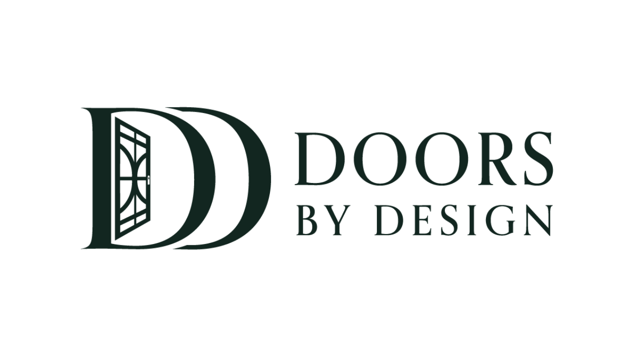
Example 1: Custom Iron Door Seller
This logo prominently features a double "D" design, with one "D" incorporating an elegant iron door icon.
The serif typography exudes luxury and craftsmanship, perfectly aligning with the company’s premium product offering.
The deep green color palette adds sophistication and a sense of timelessness, appealing to upscale homeowners and builders.
Example 2: commercial roofing company
A bold, circular logo combining patriotic elements like stars and stripes with a roofline icon. The blue and red color palette conveys trust, reliability, and pride, resonating with commercial clients seeking durable and dependable roofing solutions.
The clean, sans-serif typography complements the modern yet professional design, making it versatile across social media profiles, business cards, and vehicle wraps.

Example 3: restaurant construction company
MBL’s logo embodies a sleek design, integrating elements that signify reliability—key attributes in the construction sector. The bold use of blue conveys a sense of trust and dependability, while the red accent introduces a dynamic energy and strength. Additionally, the subtle inclusion of a construction framework highlights the company’s expertise and reinforces its core focus.

Where to Use Your Construction Logo
Once your logo is ready, it’s important to use it consistently across all branding touchpoints. Your business cards should make the logo the focal point, giving potential clients a lasting impression. On vehicle wraps, your logo can act as a mobile advertisement, ensuring visibility as you travel between job sites. Your logo can also be prominently featured on employee apparel, such as uniforms and hats, to reinforce professionalism and brand consistency while your team is on the job.
On social media, use your logo as your profile picture to create a cohesive look for your accounts. Watermark your photos and videos with the logo to protect your content and subtly reinforce your branding. Additionally, make sure your logo is displayed on job site signage to build awareness in your local community and attract future clients.

Another one of our client logos in use on their apparel and vehicle!
Choosing the Right Logo Designer
At H&A Marketing, we specialize in creating logos that not only look great but also help you grow your construction business. Our team understands the unique needs of construction companies, ensuring that every design reflects your brand’s personality and goals. With a collaborative process, we work closely with you to ensure you’re thrilled with the final design. Each logo we create is tailored to your business, making it a powerful tool for building trust and attracting clients.
Final Thoughts on Construction Logo Design
Your logo is an investment in your company’s future. A well-designed construction logo can help you attract clients, build trust, and create a memorable brand that stands out in the construction industry.
Ready to take the next step? Contact H&A Marketing today to get started on your custom construction logo design!